
Look back at shots of the peloton from 1985. Mapei pink and blue mosaics. La Vie Claire splashed in primary colours like a Mondrian on a bike. Carrera denim. Back then, pro cyclists rode around looking like they’d been dressed by a children’s TV show stylist. And if you ask us, they looked brilliant.
But now take a look at your average club ride in 2026. Chances are you’re going to see a whole bunch of kit in varying shades of black and charcoal. Maybe a bit of olive, or a flash of navy if someone’s feeling adventurous. But for the most part, it seems like cycling kit has become all about fitting in with the crowd…
So what happened to the technicolour wonder of the old days? And has cycling kit in general, become just a little bit boring? Keep reading and we’ll talk you through our theory. Plus, why Stolen Goat has never – and will never – be a brand that sets out to blend in with the crowd.
The de-saturation of cycling kit
Here’s the short version of how we think cycling kit went grey.
In the late 2000s, Rapha launched and changed the tone of the entire industry. Black, charcoal, a flash of pink. Beautifully made, expensively photographed, deliberately understated. Cycling kit suddenly had permission to look like high end, luxury apparel.
Most of the premium brands started to followed suit. Pas Normal Studios doubled down on Scandi minimalism. MAAP did sage and stone. Le Col polished it up. Suddenly, the aspirational cyclist wore charcoal.
By the mid-2020s, the muted aesthetic had won. Walk into any cycling shop and you’d see racks of black, navy, olive, terracotta, dusty pink. The vintage Mapei energy was gone. Cycling Weekly even ran a piece this year asking, plainly, where’s all the garish kit? We have a one-word answer: it’s right here, at Stolen Goat.
It’s not that there’s anything wrong with a parred back, minimalist approach to cycling apparel. It just seems a shame that it’s becoming harder than ever to find stand out cycling kit that helps you to express your individual style. Which is precisely why we’ve remained committed to creating cycling gear that offers high end quality, premium performance and unique designs.
Bold kit for bold riders: Why Stolen Goat never went grey
Stolen Goat started back in 2012 with one simple, but important, mission in mind: To inspire people to find freedom through sport so that they can live happier, healthier lives. And we felt that freedom should extend to the kit you wear, as well as the adventures you explore.
We looked at the cycling apparel market, and we didn’t recognise ourselves in it. We wanted the fun we have on two wheels to be reflected in the gear that we wear. We wanted to create a community where it’s all about having the confidence to stand out from the crowd, rather than feeling like you have to blend in and be one of the flock.
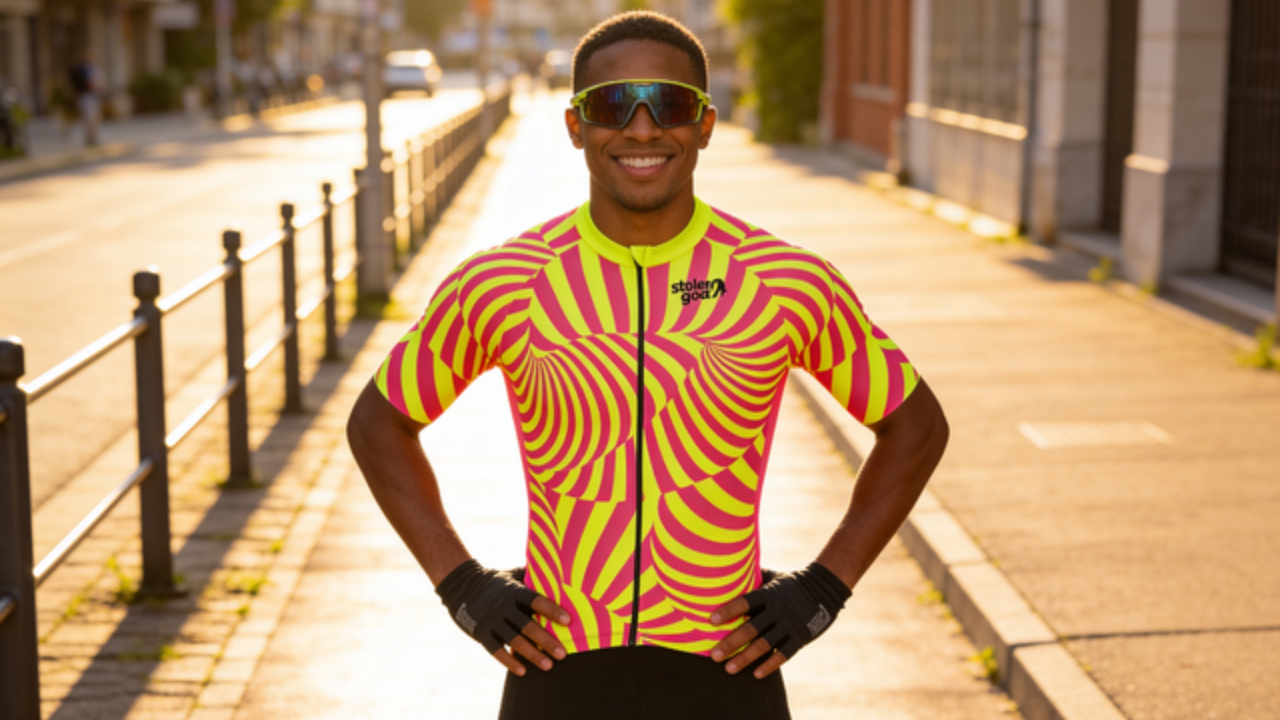
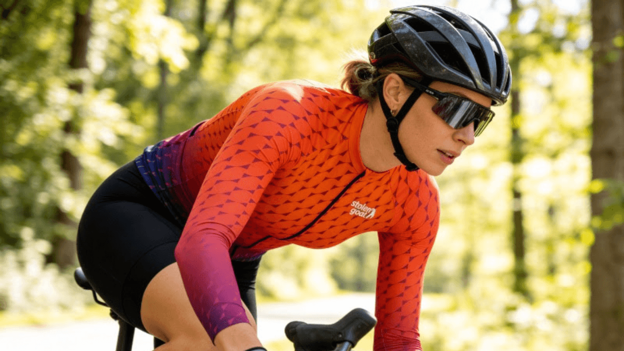
So we made bold, colourful kit, and we’ve stuck with it. Bright prints. Blocks of colour. Daring lines and complex patterns. Designs that don’t apologise, with the odd marmite ‘love it or hate it’ style thrown in for good measure. We love that our kit is a conversation starter. And we’re proud that, where it might have been easier to tone it down to fit in with the crowd, we’ve stood our ground and continued to be boldly loud and proud.
Premium quality kit, with designs that aren’t afraid to speak for themselves. That’s not a marketing position. That’s just what we love to do.
You can read more about the Stolen Goat origin story here, or get the elaborate “tail” behind our name here.
Is bright cycling kit better? The case for colourful cycling gear
We don’t just make bright cycling kit because we want to rebel against being boring. There’s also a few genuine reasons behind all our wonderful (and sometimes weird, granted) designs.
Visibility (the actual safety case for bold cycling kit)
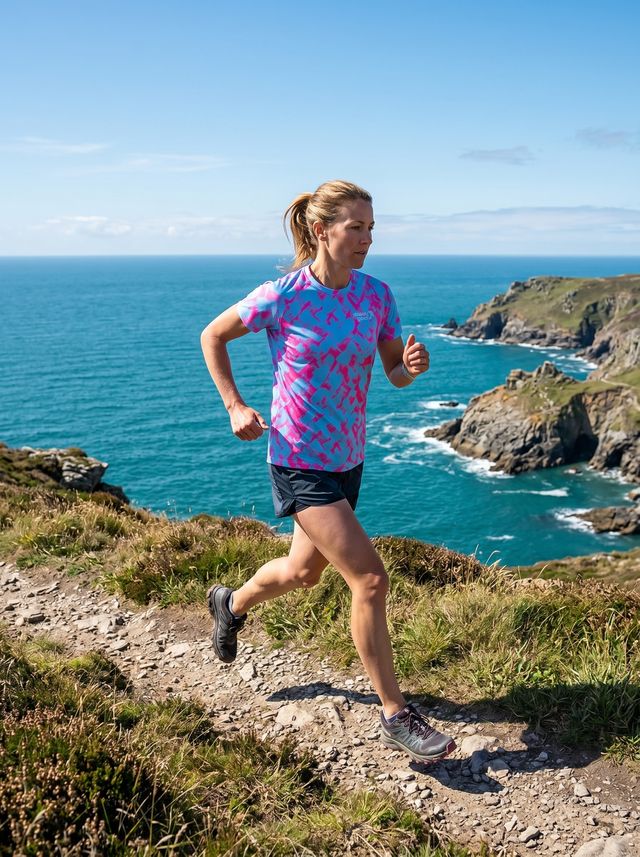
Drivers see colour better than they see grey. There’s research on this – high-contrast, saturated colours are detected earlier and more reliably than muted tones, especially in low-light or peripheral vision. If you’re riding in changeable UK weather, on roads where you’re sharing space with cars and lorries, the difference between a black jersey and a bold yellow or pink jersey isn’t just about aesthetics, it’s also about visibility and reaction times. If you ask us, bold colour is a safety feature.
Joy, fun and freedom
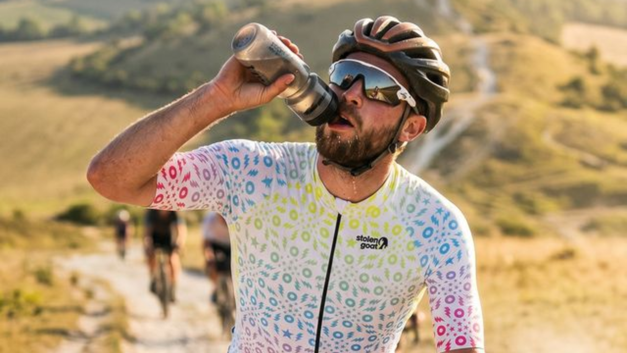
Cycling kit doesn’t have to be purely functional. Obviously, it’s needs to be that as well – and our kit never compromises on comfort or quality for the sake of style. We do all three, pretty darn well (and with well over 7,000 5* reviews, our customers agree!) But when you’re going to spend hours of your spare time wearing something, surely it should be a chance to break away from corporate dress codes and muted tones? We think cycling kit should put a smile on people’s faces. It should warrant a second glance. It should look as good as cycling makes you feel.
Identity
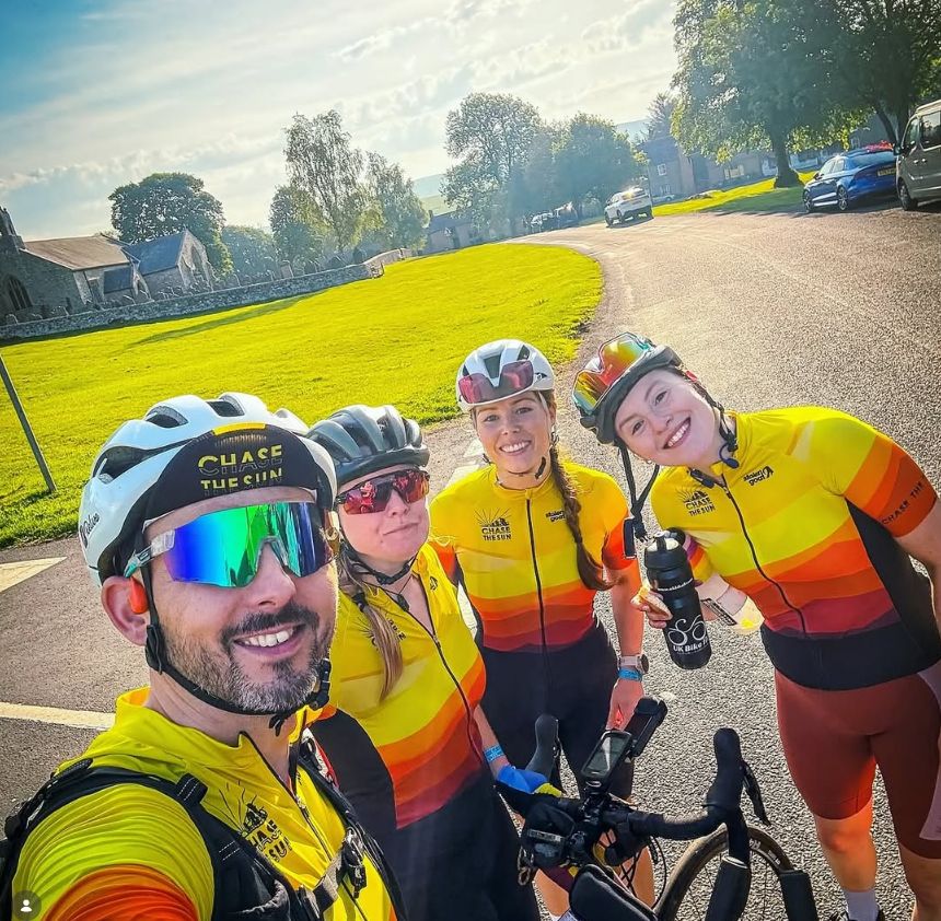
You can spot your mate in a peloton if they’re wearing a Stolen Goat. You can’t if everyone’s in black. We were at one of the UKCE events recently, and we could spot people who’d rocked up in Stolen Goat kit from a mile off – including some true ‘vintage’ SG styles that instantly got us chatting to the riders wearing them. Bold kit doesn’t just start conversations, it builds community. And let’s face it, it makes your group snaps look significantly more interesting (send us yours here, by the way).
What “bold and colourful” actually means
Here’s the catch: embracing bold designs and bright colours isn’t the same as just churning out cycling jerseys that are loud for the sake of being loud.
A bad, bold jersey isn’t marmite. It isn’t ‘love it or hate it’. It’s just ‘hate it’. Poorly designed, cheaply made… nope, not in our Herd! A good bold cycling jersey takes time, artistry and effort to create. Our chief designer gets his inspiration from the wildest of places, and puts all manner of blood, sweat and tears into turning that spark of genius into a jersey which, whether it’s to your taste or not, is objectively an impressive bit of artwork. We even had the chance to transform famous bits of art into cycling jerseys with our collaboration with Tate!
Anyone can choose a shade of grey or khaki and give it a fancy-sounding name. But pushing the envelope with designs that’ll have people talking about them years after they’ve sold out? That’s something different. And doing so without cutting any corners on comfort, performance or quality so you can wear your gear season after season? That’s Stolen Goat.
Four jerseys we think prove the point
These are from our current collection. They’re not the loudest things we’ve ever made (though Gong has surely got to be a contender). They’re the ones where we think we showcase the bold-but-considered balance – and the fact that ‘stand out’ comes in a multitude of styles.
Gong
The one we famously had an argument in the office about. Some say it looks like a ‘Refresher’ sweet. Others reckon it’s secretly got hypnotic powers (hey, maybe you can use it to wrangle a free cake at the cafe stop!?). It might not be everyone’s cup of tea, but those that love it… really love it. It’s been a huge hit with our Herd in our most recent SS26 drop. And with its sweeping lines and beautifully bright colours, this is a jersey that certainly makes a statement.


Vice
At first glance, a beautiful orange to purple sunset-inspired gradient fade. On second glance, the intricate geometric pattern gives it that extra something-something. Perfect for those crisp spring rides.


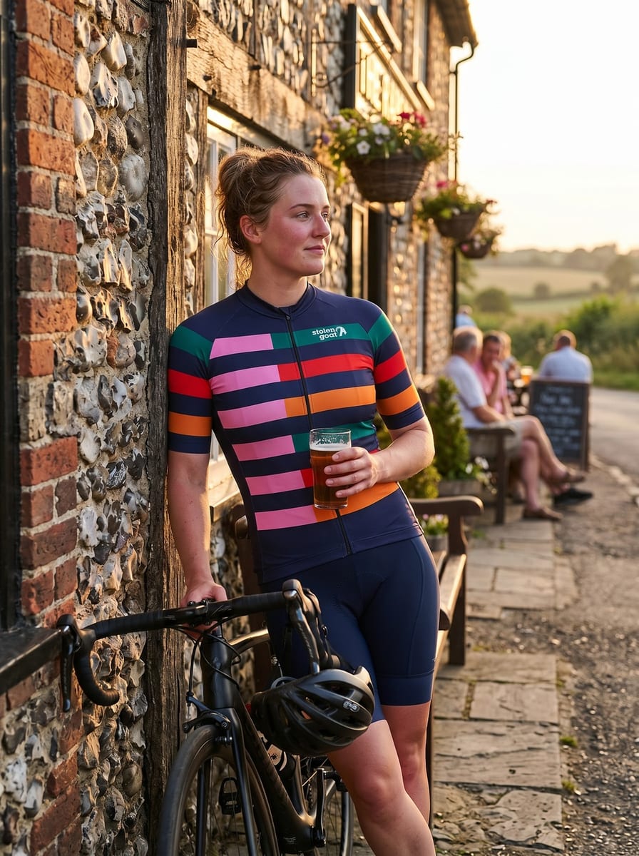
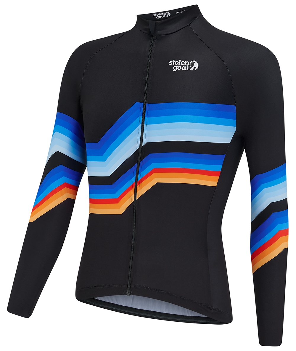
Analog
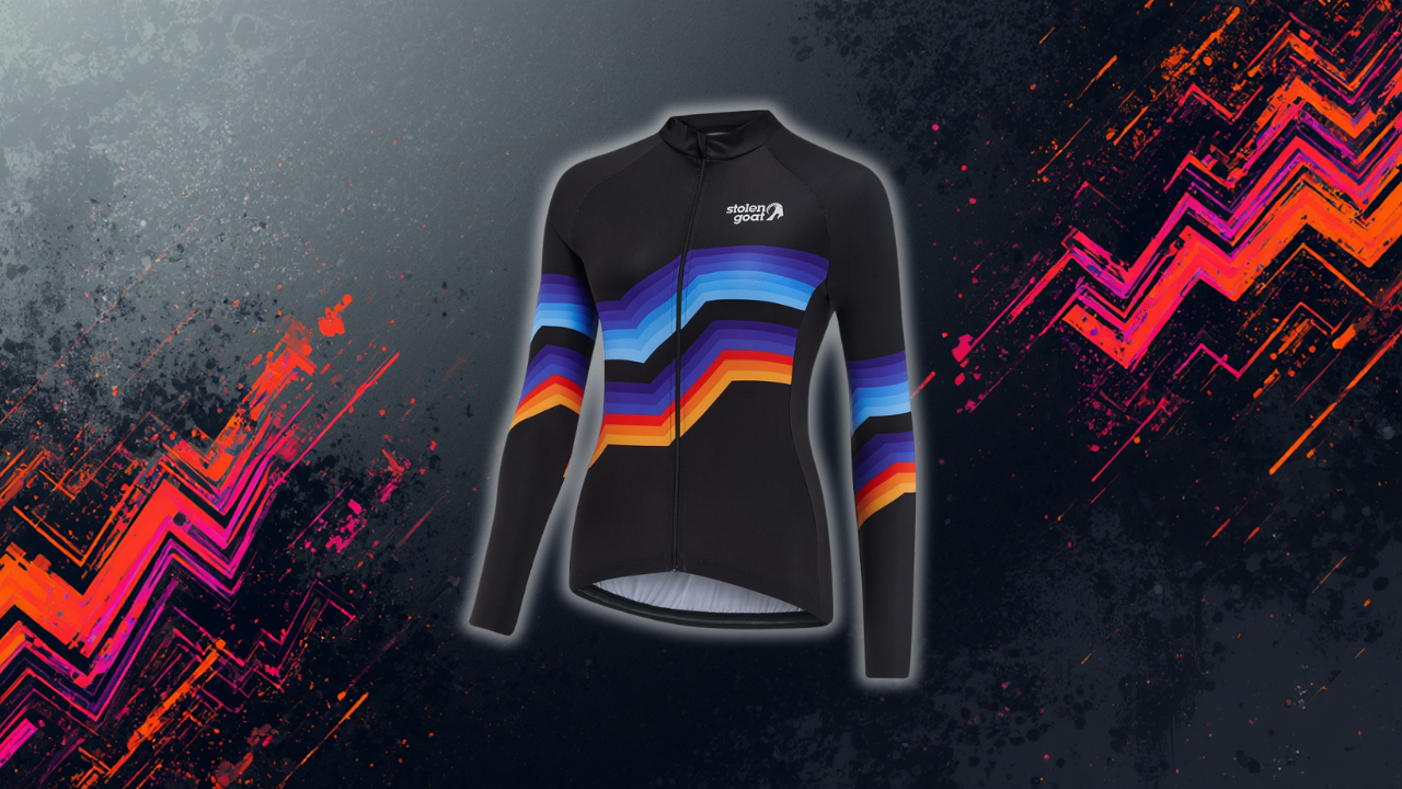
Classic stripes are a cycling staple – and we have our own Stolen Goat take on them in our Batiste, Voltaire and Gazelle jerseys (all of which you’ll find in our SS26 collection). But for those who want stripes with even more of an SG twist – you’ll love our Analog long sleeved jersey. Almost Bowie-esque (we’re talking Ziggy Stardust) it’s the perfect homage to that bold kit of the 80s we were bleating on about earlier. Bold doesn’t have to mean lairy.

Faze
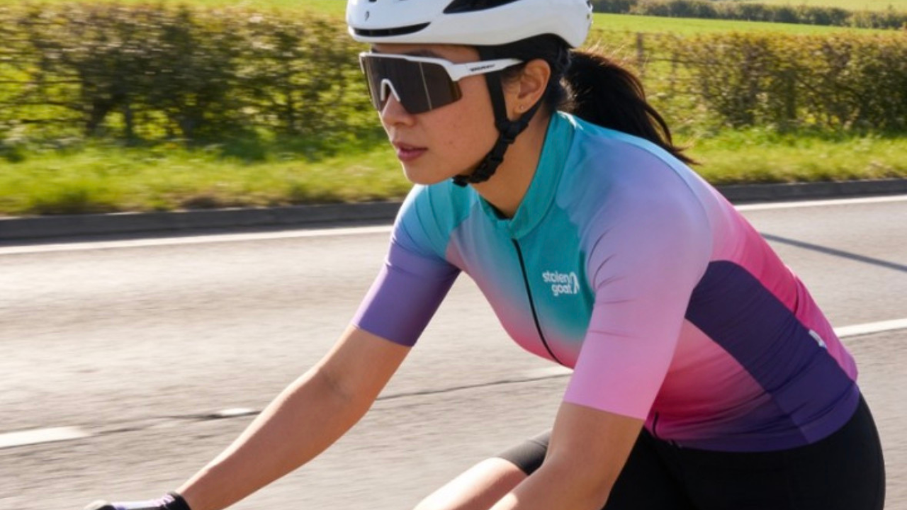
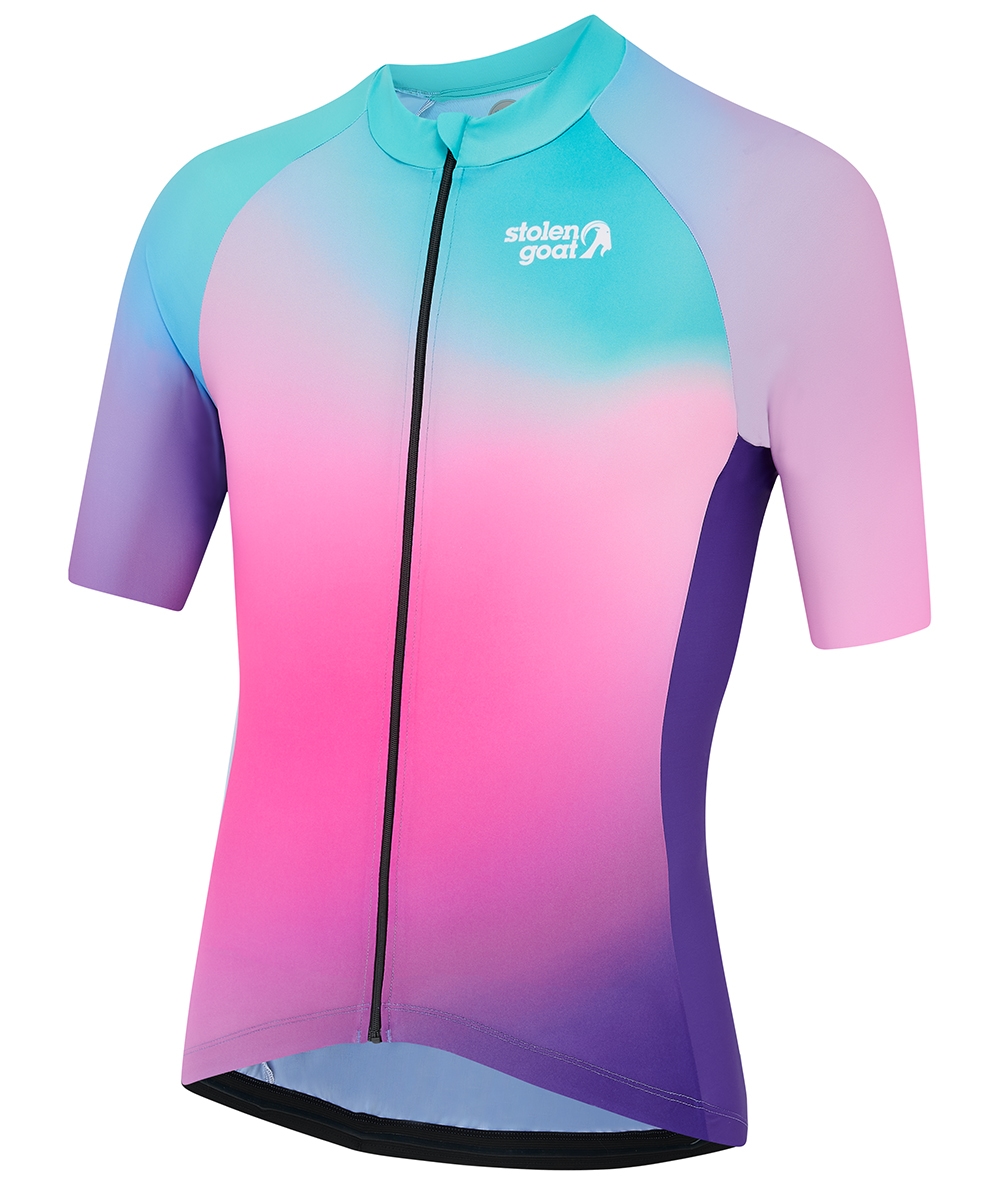
And last, but definitely not least, is Faze. Candy floss colours in a beautiful gradient fade that really needs to be seen in real life to be appreciated. Proof that you can go modern and sleek, without succumbing to muted tones that’ll have you blending in with the undergrowth.

If you want to see the rest of the range, men’s jerseys live here and women’s jerseys live here. Or you can check out the latest collection, including run gear and accessories.
Custom kit for clubs who agree with us
Bored of boring club kit that no one actually likes the look of? Us too. If your club is ready to up their kit game, we make custom kit too. You can play around with our AI design tool to get your creativity flowing, then our expert designers will take your initial concepts and transform them into a custom cycling kit collection that will genuinely look incredible and get your club noticed. Learn more about the Stolen Goat custom kit process or head straight over to our Custom website to get started.
Add some colour to the kit drawer
If your kit drawer has gone all grey and you’ve started wondering when riding became a corporate event, this is your sign. One bright jersey changes a season.
Cycling didn’t used to be muted, and it doesn’t have to be now. Join the Herd: Stand out from the crowd. Shop bold cycling kit for bold riders.
FAQs
Are bright cycling jerseys safer than dark ones?
Research has found that drivers detect high-contrast, saturated colours more reliably than muted tones, particularly in low light, peripheral vision, and changeable UK conditions. Think of a bold, brightly coloured jersey as a passive safety feature that can help you to be seen.
What colours are most visible to drivers?
High-contrast colours – saturated yellow, orange, red and pink – perform better than dark or muted tones in both daylight and dawn/dusk conditions. Reflective elements add another layer for after-dark visibility.
Do bold cycling jerseys go out of fashion faster?
No, quite the opposite! The cycling kit that looks dated fastest is the kit that’s trying to be too of-its-moment. Strong colour, considered design, and a clear visual identity tend to age well. Vintage Mapei still looks great forty years on.
Where can I buy bold colourful cycling jerseys in the UK?
Well, right here at Stolen Goat for starters! We offer UK-designed, premium quality cycling kit and running apparel in a whole range of beautifully bold designs. We’re also big fans of female-founded brand IRIS, and over on our sister site, VeloVixen, you’ll also find a range of bright cycling kit designed by women, for women.
Why did cycling kit become so muted in the 2020s?
Premium cycling brands leant in to a minimalist aesthetic, bringing the muted tones of premium fashion to the peloton. It worked, but then it became dominant, to the point of becoming boring.
Stolen Goat: Bold kit, for bold riders. Designed in the UK. Made for cyclists who want to stand out from the crowd.